
How to measure enterprise video success
shootsta.
How to measure enterprise video success
By Shootsta · Published May 24, 2026 · Updated October 2026
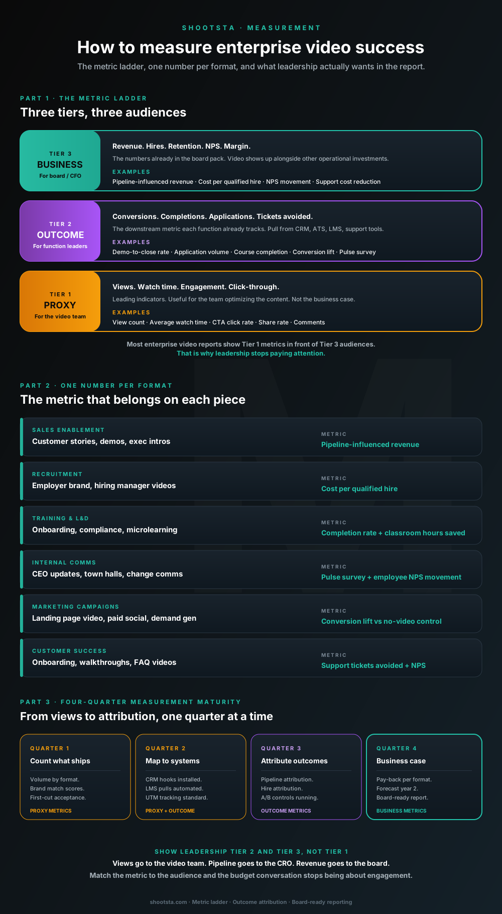
Most enterprise video reports show views to people who care about pipeline. The fix is a three-tier metric ladder, one downstream outcome per format, and the four-quarter maturity curve that moves from counting views to attributing revenue.
Why most video reports get ignored by leadership
Most enterprise video reports lead with view counts, watch time and engagement rates. Next comes a count of how many videos shipped, with a thumbnail of the best-performing piece on the cover slide. The CFO reads none of it. Pipeline, hires, retention and revenue are the language leadership uses. Views are not in that vocabulary, so the report gets nodded through politely and the budget conversation never improves.
You do not need to stop measuring views, because they are useful for the video team. The fix is to put the right tier of metric in front of the right audience. There are three tiers, and each one has its own audience.
The three-tier metric ladder
Every video program produces metrics at three tiers, and each tier speaks to a different group. If you show a group the wrong metric, the conversation stops working.
Tier 1: Proxy metrics (for the video team)
This tier covers view count, average watch time, click-through rate, share rate and comment volume. These are leading indicators of whether a video is reaching its audience and holding attention. They help the team testing thumbnails, hooks, durations and distribution channels, but they do little to justify budget.
Tier 2: Outcome metrics (for function leaders)
This tier covers demo-to-close rate, application volume per role, course completion, conversion lift, pulse survey movement and support tickets per customer. Each function already tracks these downstream business metrics in its CRM, ATS, LMS, support tools or analytics. This is the layer that connects video to the business and is the layer most enterprise reports skip entirely.
Tier 3: Business metrics (for the board and the CFO)
This tier covers pipeline-influenced revenue, cost per qualified hire, NPS movement, support cost reduction and retention. These numbers are already in the board pack. When video shows up at this tier, it sits alongside other operational investments and gets evaluated the same way.
The habit to build is simple. Show the video team Tier 1 in dashboards, show function leaders Tier 2 in their quarterly reviews, and show leadership Tier 3 in board packs. You use the same data and the same program, rolled up three different ways.
Interactive metric mapper
Which downstream metric should you attach to each video format?
Toggle the formats you produce today. The mapper shows the outcome metric, source system and rough industry benchmark for each. Use it as the starting point for a board-ready measurement plan.
Formats you produce
Toggle one or more formats above to see the metric, source system and benchmark.
Benchmarks are typical ranges across enterprise programs. Your specific lift depends on baseline performance, distribution, and quality. Treat them as starting hypotheses, not warranties.
One downstream metric per video format
The most useful single discipline in enterprise video measurement is assigning exactly one Tier 2 outcome metric per format. Resist the urge to track several. Picking the right one is half the work; defending it as the success number is the other half.
Sales enablement videos
Metric: demo-to-close rate, pulled from CRM. Roll up: pipeline-influenced revenue. What to compare: the close rate on accounts that watched a customer story video before the demo against accounts that did not. The mechanism: video pre-qualifies the buyer, reduces concept-explaining time in the demo, and gives champions an asset to share internally with their committee.
Recruitment and employer brand
Metric: qualified applications per role, pulled from ATS. Roll up: cost per qualified hire. What to compare: application volume on job descriptions with employer brand video against the same roles without it. For high-volume roles or competitive markets, this is often the highest-ROI video category in the program.
Training and L&D
Metric: course completion rate, pulled from LMS. Roll up: classroom hours saved + retention. What to compare: completion rates for video-led modules against classroom or text-based versions of the same course. Check retention 30 days out as well, because completion alone does not show what people remember.
Internal comms
Metric: pulse survey movement on the topic covered, pulled from pulse / HRIS tools. Roll up: employee NPS movement. What to compare: the score on "I feel informed about company direction" before and after CEO updates move to video from email or town-hall slides. Tie the survey question to the campaign topic and the attribution becomes clean.
Marketing campaigns
Metric: conversion rate lift versus a no-video control, pulled from analytics and ad platforms. Roll up: marketing-influenced pipeline. Industry benchmark: 20 to 80% conversion lift on landing pages with video versus the same page without. Run a 50/50 split for one campaign and you have a number you can scale across the rest of the program.
Customer success
Metric: support tickets per customer, pulled from support tools. Roll up: support cost reduction + NPS. What to compare: repeat tickets among customers onboarded with video walkthroughs against customers onboarded without them. This is often the most under-measured category because the saving lives inside the support team's budget, not the video team's.
The four-quarter measurement maturity curve
You are unlikely to move from counting views to attributing revenue in one quarter. A realistic curve takes four quarters, and skipping ahead produces dashboards that nobody trusts.
Quarter 1: Count what ships
Measure the things you can see right away. That means volume by format, brand match scores from the brand custodian and the first-cut acceptance rate. Add turnaround times and capacity utilization. This measures the operating model rather than the business case, and the goal of quarter 1 is to prove the production engine works.
Quarter 2: Map to business systems
Install CRM hooks, LMS pulls, UTM tracking and pulse-survey integrations. Each format gets a Tier 2 metric assigned and pulled from the right source system. The data pipeline is built before the attribution conversation starts. By the end of quarter 2, every format has a credible outcome number, even if the volume is too small to be conclusive.
Quarter 3: Attribute outcomes
By now, volume is high enough to spot patterns. A/B controls are running on the marketing campaigns, and both pipeline and hire attribution are mapped. The first credible outcome-level numbers go into function-leader reviews, and the Tier 2 dashboards start to hold real data.
Quarter 4: Build the business case
Tier 3 reporting is ready, and pay-back per format is calculated. The year-2 forecast is built on year-1 data instead of vendor claims. The report leadership sees fits on one page and answers "what did we get for the spend?" with numbers from systems they already trust. Budget renewal stops being political and starts being arithmetic.
What to measure when the program is too new for outcomes
In quarter 1 and most of quarter 2, the outcome data is not yet credible because the volume is too low or the systems are not yet plumbed. Measure these instead and you will still have a defensible story to tell.
Start with production capacity utilization, which shows whether you are using your subscription tier or leaving half of it idle. Track brand match score by piece to see whether scores are improving or drifting. Score stakeholder satisfaction each quarter with a simple internal pulse, so you know whether the function leader who briefed the work is happy with the output. Watch the speed of the first cut to check that the 48-hour bar is holding. Finally, track cycle time from brief to delivery, which should drop as the team beds in.
These are not the metrics leadership will eventually want. They are the metrics that prove the engine is running. By quarter 3, outcome metrics should replace or add to them. By quarter 4 they should be a footnote in a Tier 3 report.
Common measurement traps to avoid
These three patterns destroy credibility faster than having no measurement at all.
Single-vendor reporting math
If the only source for the success numbers is the video team or the production partner, the numbers will be questioned. Always pull outcome metrics from systems the rest of the business already trusts (CRM, ATS, LMS, analytics). If you have to ask the audience to trust the video team's data, the report will not change minds.
Engagement averaged across formats
"Our average view rate is 62%" tells you nothing. A 90-second customer story should have a higher view rate than a 12-minute training module. Averaging across formats hides the formats that are working and the ones that are not. Report each format on its own line instead of one total.
One quarter of cherry-picked data
If a single piece performed exceptionally well, it is tempting to lead the report with it. Leadership has seen this before and will discount the data. Show the median and the spread alongside the best example. Honest measurement builds trust over time, while cherry-picked numbers lose credibility on the first miss.
How Shootsta supports the measurement work
For enterprise subscription customers, we wire the measurement plan into onboarding. That means agreeing the one metric per format up front, installing the source-system hooks (CRM, LMS, analytics) in quarter 2, and building the quarterly Tier 2 and Tier 3 reports into the QBR cadence. The deliverable is your measurement plan, populated with your data, in the format leadership already trusts. We do not build a separate Shootsta dashboard that competes with your existing reporting.
The metric ladder, the format-to-metric mapping and the four-quarter rollout are the same approach we use across financial services, professional services, technology, aviation and pharma customers. The sector details change from client to client, but the method stays the same.
Frequently asked questions
What is a realistic timeline to credibly attribute revenue to video?
Three to four quarters for most enterprise programs. Earlier than that you have anecdotes; later than that you have stopped iterating. The four-quarter curve above maps to this honestly.
How do we measure internal comms video when there is no obvious outcome metric?
Use pulse surveys, and write the pulse question to match the campaign. If a CEO video addresses an organizational change, the next pulse should include "I understand the rationale for the recent change" with a 1 to 5 scale. The before-and-after movement is the metric. Tie it to the campaign and the attribution holds up.
What benchmarks should we expect in year one?
Expect wide ranges, and set your own baseline before you set a target. Measure close rate on touched accounts for sales enablement, application volume for recruitment and repeat support tickets for customer success. Your results depend on baseline performance, distribution and brand category. Treat any published benchmark as a starting hypothesis for your own program rather than a promise.
What metric do we use for hero or Peak content?
Peak pieces are usually measured on brand and reach rather than direct outcome. Useful measures include audience sentiment, share rate among target accounts, earned media mentions and pulse-survey movement on brand attributes. Pure outcome attribution on Peak pieces is unreliable because the audience and intent are different from Pulse and Presence work. Be honest about that with leadership rather than forcing a number.
Should we measure ROI per video or per program?
Measure ROI per program. Per-video ROI invites the wrong conversation ("which video had the best ROI?") because most enterprise video value comes from the cumulative effect of the program. The right report is annual program payback (Tier 3) supported by per-format outcome attribution (Tier 2). We covered the program-level ROI model in the business case for enterprise video.
How do you handle attribution across functions when one video drives multiple outcomes?
Assign primary attribution to the function that briefed the work and report secondary outcomes as a note. A customer story video briefed by sales is primarily a sales metric (pipeline) with a secondary marketing metric (conversion lift). Splitting credit across functions creates more arguments than it resolves; assign cleanly and let the secondary value count as upside.
How we built the numbers in this post
The one benchmark range in this piece comes from published industry research. The other sections tell you what to compare, because we quote no Shootsta customer outcome figures, and the sources for each claim are below.
- Close rate, application volume, course completion and pulse survey comparisons. These sections name the comparison to run and give no figure. Published research from Gartner, Forrester, Vidyard, LinkedIn Talent Insights and Brandon Hall Group covers these areas if you want an outside reference point.
- 20 to 80% conversion lift on landing pages with video. Published industry research including Wyzowl's annual State of Video Marketing report, HubSpot's marketing research and Unbounce conversion benchmarks. The wide range reflects vertical, traffic source and format.
- Repeat support tickets after video onboarding. This section names the comparison to run and gives no figure. Support tooling vendors such as Zendesk and Gainsight publish their own research on onboarding and ticket volume.
- Four-quarter measurement maturity curve. A sequence we recommend for building measurement over a year. Quarter 1 measures the production engine; quarter 2 plumbs the data; quarter 3 attributes; quarter 4 builds the year-2 business case.
Editorial standards
- Numbers cited are the most up-to-date figures we had at the time of writing. The "last updated" date on this page is when the numbers and sources were last reviewed.
- External benchmarks come from publicly available salary, labor and industry data. We name the source where possible and summarize where the underlying data sits behind a paywall.
- Figures and ranges come from the public sources cited on this page and from published market rates. We do not quote any Shootsta customer outcome figures here.
- Where ranges are given, they cover variability across sector, geography and program maturity. Treat them as starting hypotheses for your own program rather than promises.
- Spotted a number you would challenge? Let our editorial team know what you are seeing in your business and the data behind it. Material updates get credited in the post footer.
Where to go next
For the budget framing leadership cares about, read the business case for enterprise video. For the strategy framework the measurement plan should map back to, read how to build a video strategy from scratch. For an operating model that can deliver against the measurement plan, read how a video partner extends your in-house team.
Measurement is the last of the five measures in the CMO video scorecard. Ten questions will tell you whether reporting is your weak point, or whether coverage and cost per video are costing you more.
To build a measurement plan for your team, book a free consultation.
Take this article with you
Read the latest at shootsta.com/blog/how-to-measure-enterprise-video-success
You might also like
How to Brief an Animation Project
How to Brief an Animation Project
An animation brief is the document you send to your production partner before work starts. Get it right and you cut revision cycles in half. Get it wrong and you discover mid-production that everyone disagrees on what the video is for. This is what a complete brief looks like.
Animation for change management comms
Animation for change management comms
Animation handles change management communications better than live video for three reasons: no on-camera executives required during sensitive periods, scene-level updates when plans shift, and a single production that works across global teams with voiceover-only language swaps.
How sales leaders should use video at scale
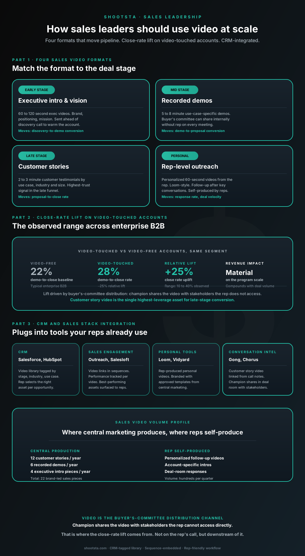
Sales leaders mostly think about video as personalized rep outreach (Loom, Vidyard) or as marketing-produced customer stories. Both are useful. The bigger opportunity is the buyer's-committee distribution layer: assets the champion shares internally with stakeholders the rep does not access directly. That is where the close-rate lift compounds.
How L&D leaders replace classroom with video
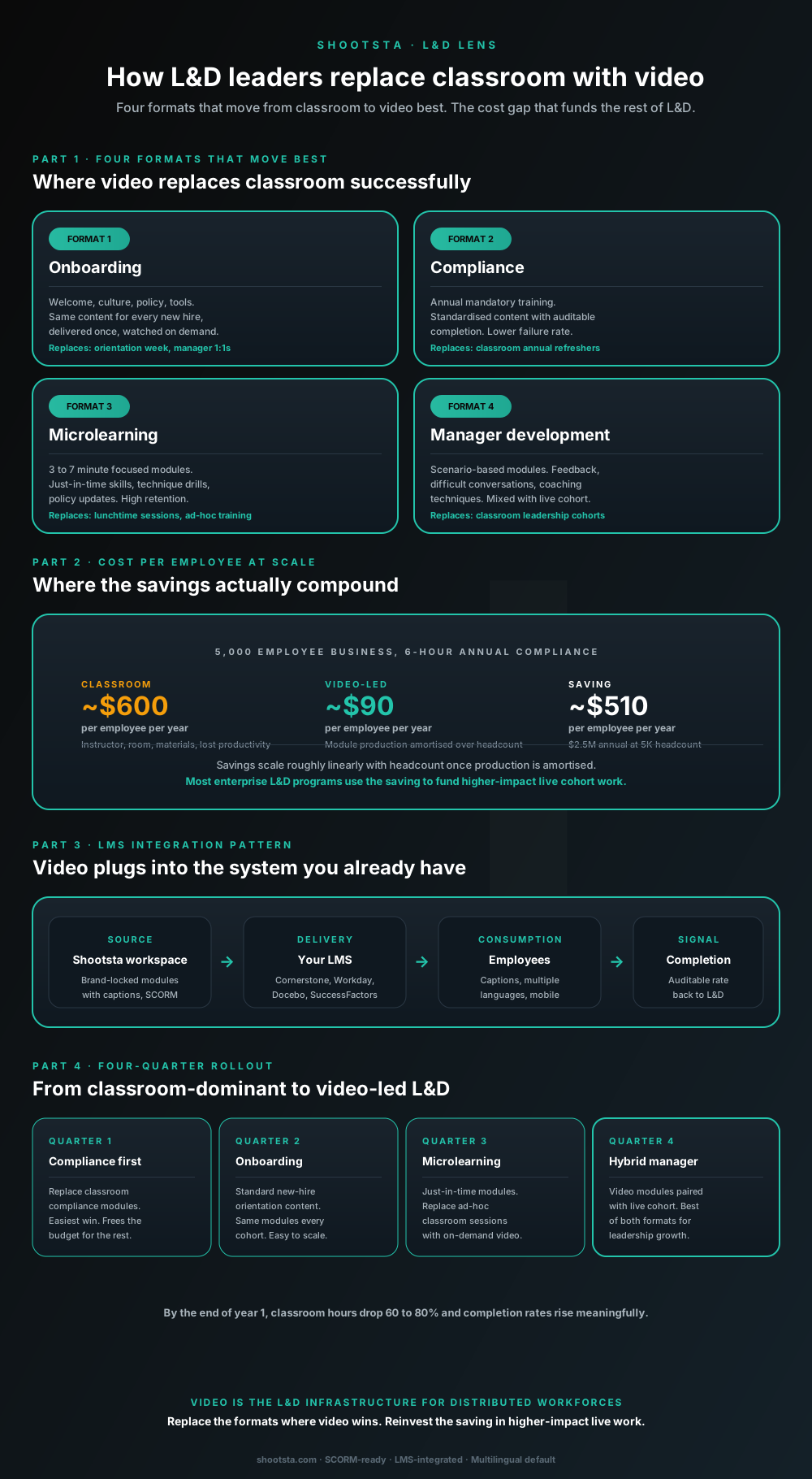
L&D leaders running classroom-heavy training programs typically have the largest single opportunity in the business to free budget through format change. Four training formats move from classroom to video cleanly; the savings fund higher-impact live work. Here is the rollout that compounds learner adoption over four quarters.
How customer success leaders should use video
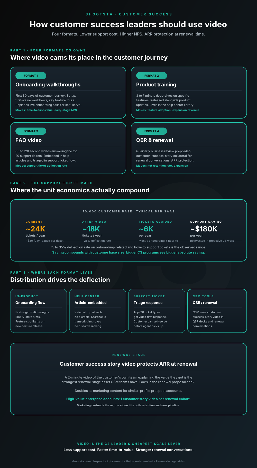
Customer success leaders are usually under-resourced for both reactive support volume and proactive retention work. Video is the cheapest lever to fix both - 15 to 35% deflection on onboarding and how-to tickets, faster time-to-value, and renewal-stage customer story video that lifts net retention. Here is the four-format model and where each piece earns its place.
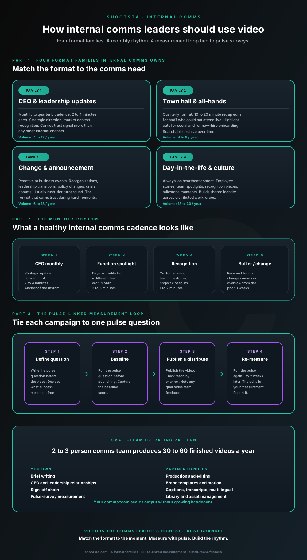
How internal comms leaders should use video
Internal comms leaders are usually under-resourced for the volume of video the business wants. The fix is not more headcount; it is structuring the program around four format families, a monthly rhythm, and a pulse-survey-linked measurement loop. Here is the operating pattern that lets a small comms team produce 30 to 60 finished videos a year.